UX-led HMI evolution
Objective
Create an HMI that reduces cognitive load and increases driver confidence. Make the most‑used actions effortless, design for glanceability and voice, and ensure the system feels distinctly Polestar.
Approach
Lead with UX discovery, then orchestrate cross‑functional delivery through tight Product, Engineering, and DesignOps alignment. We framed the work around safety, speed and serenity—three lenses used to assess decisions across journeys.
Activities included rapid field research, heuristic evaluations of competitor HMIs, task time studies, and service blueprints. We then established an interaction model, information architecture and a component system that enabled fast iteration without sacrificing quality.
Key design and product moves
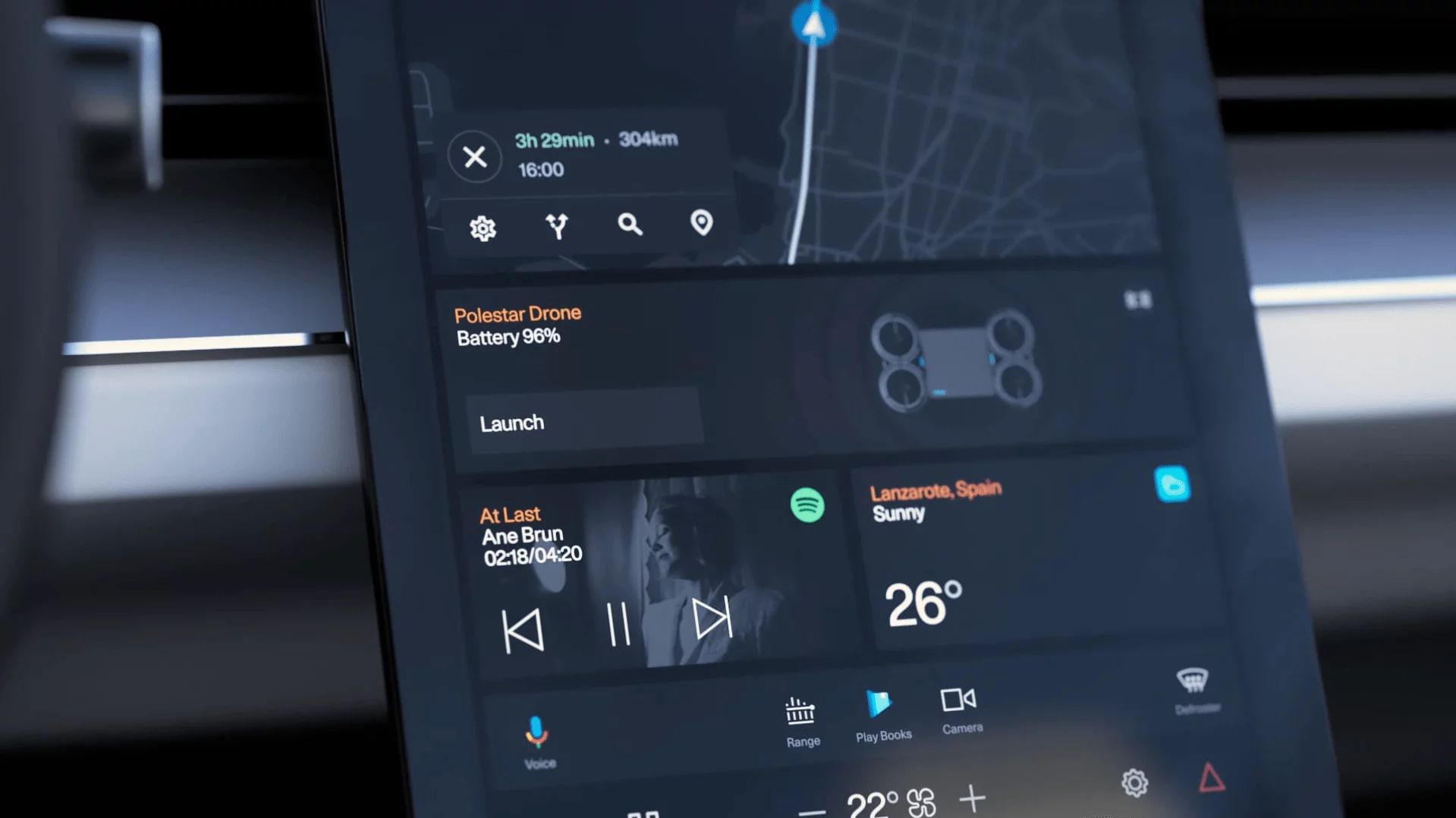
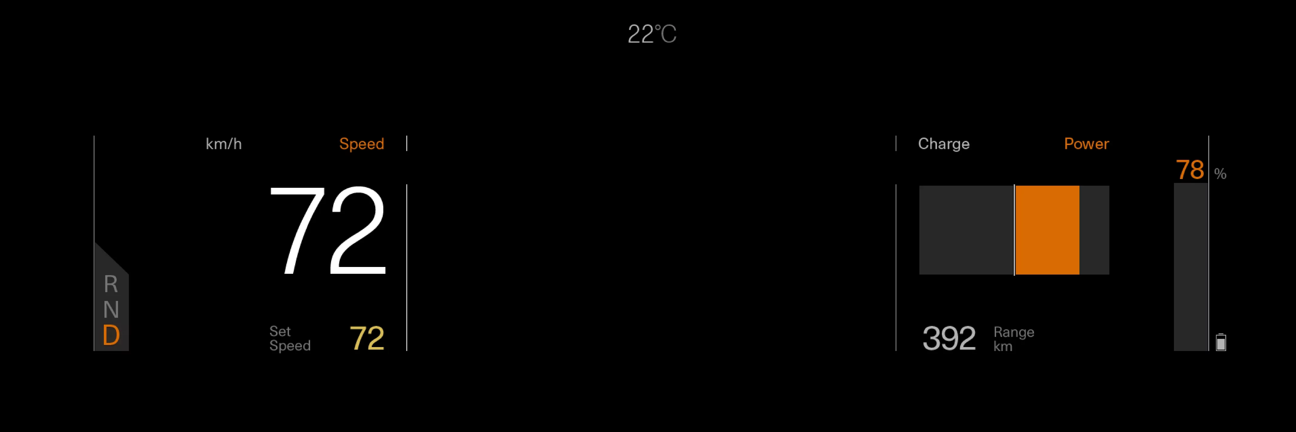
- Driver‑first IA and glanceable layouts for critical flows (navigation, media, climate).
- Voice‑first interactions and fail‑safe patterns for eyes‑on‑road scenarios.
- Adaptive theming calibrated for lighting conditions (day/night, contrast, color temperature).
- Motion as meaning: restrained transitions that convey context, never distract.
- Design system and tokens unified with engineering; CI hooks and linting for UI consistency.
- DesignOps rituals: crits, UX reviews, definition of done, and KPI dashboards.
Challenges & solutions
Balancing aesthetic minimalism with legibility at a glance; aligning voice, touch and steering‑wheel inputs; and governing quality at speed. We addressed this with measurable heuristics, a shared checklist for contrast and target sizes, and paired design–engineering spikes before committing roadmaps.
Outcome
A coherent HMI that feels calm yet responsive. The system guides rather than shouts, shortens routine tasks, and aligns brand expression with safety and performance. The foundations—IA, patterns, and system tokens—enable sustainable iteration across trims and markets.