👋 Hi! I'm Carmelo's AI assistant. I'm trained on his portfolio, case studies, and expertise in design and digital transformation. Ask me anything about his work, design process, or career!
This AI model is in beta and may not always be accurate.
Building UX from the ground up inside Australia's leading ERP platform
2022–2026 | Case study
by Carmelo Bisignano, User Experience Designer Lead
"Carmelo's been an absolute legend to work with. He jumped into our UX space with confidence and clarity, helping shape some pretty critical experiences."
Jamie Thomas
Product Management Applications Lead at Pronto Software
Pronto Software is Australia's leading ERP vendor, serving mid-to-large enterprises across manufacturing, distribution, and services. Facing a strategic replatforming from a legacy 4GL architecture to a cloud-native, microservices platform, the company launched the New Technology Stack (NTS) initiative — and with it, the need to build a UX practice from scratch.
I was brought in as UX Designer Lead to do exactly that: establish the design discipline, build the design system, and shape the product experience across every surface of Pronto Xi — in an organisation that had shipped software for decades without a designer in the room. The engagement spans six product surfaces: the Employee Portal (desktop and mobile), employee onboarding, an embedded AI assistant, a global navigation and search system, a no-code UI builder, and customer communication journeys. Four years in, the work is still active.
Problem: designing UX in an engineering-first culture
No component library. No design language. No shared process between design and engineering. The challenge wasn't just to design a better interface — it was to make design matter inside a company that had never needed to.
The users' reality was just as fragmented. Payroll officers were manually processing employee awards, tracking timesheet variances across spreadsheets, and relying on colleagues to verify data accuracy. The system gave them no proactive visibility — they had to log in to discover problems, rather than being told about them. Onboarding happened through email chains and paper forms. There was no single point of access for KPIs — staff paid, gross totals, pay run variances — and no automation where it was most needed. And the architecture was moving while I built. Transitioning from a monolith to microservices meant design decisions often had to precede engineering ones — not follow them. Regulatory constraints — superannuation validation, BSB account verification, GDPR/CCPA — added further complexity. Every flow had to be architecturally correct before it could be visually designed.
Research: the operating rhythm of the engagement
Research wasn't a phase — it was the operating rhythm of the entire engagement. The process was formalised in a DesOps framework I established from the outset: Empathise → Define → Ideate → Prototype → Test, with recursive feedback loops between discovery and delivery. Every sprint was grounded in documented evidence. No preferences, no assumptions.
Discovery: understanding the system from the inside out
The engagement began in September 2022 with a structured discovery phase. Before a single wireframe was drawn, I ran workshops with the ux team support, and the wider engineering team to map the current information architecture, walk through existing payroll officer and employee journeys, and identify where the legacy system's organisation structure was failing users. These sessions produced a Concept of Operations document that articulated the new system's characteristics and became the alignment tool between design, product, and engineering stakeholders. Requirements couldn't be written until the ConOps was validated; the ConOps couldn't be validated until users' mental models were understood.
Listening to users
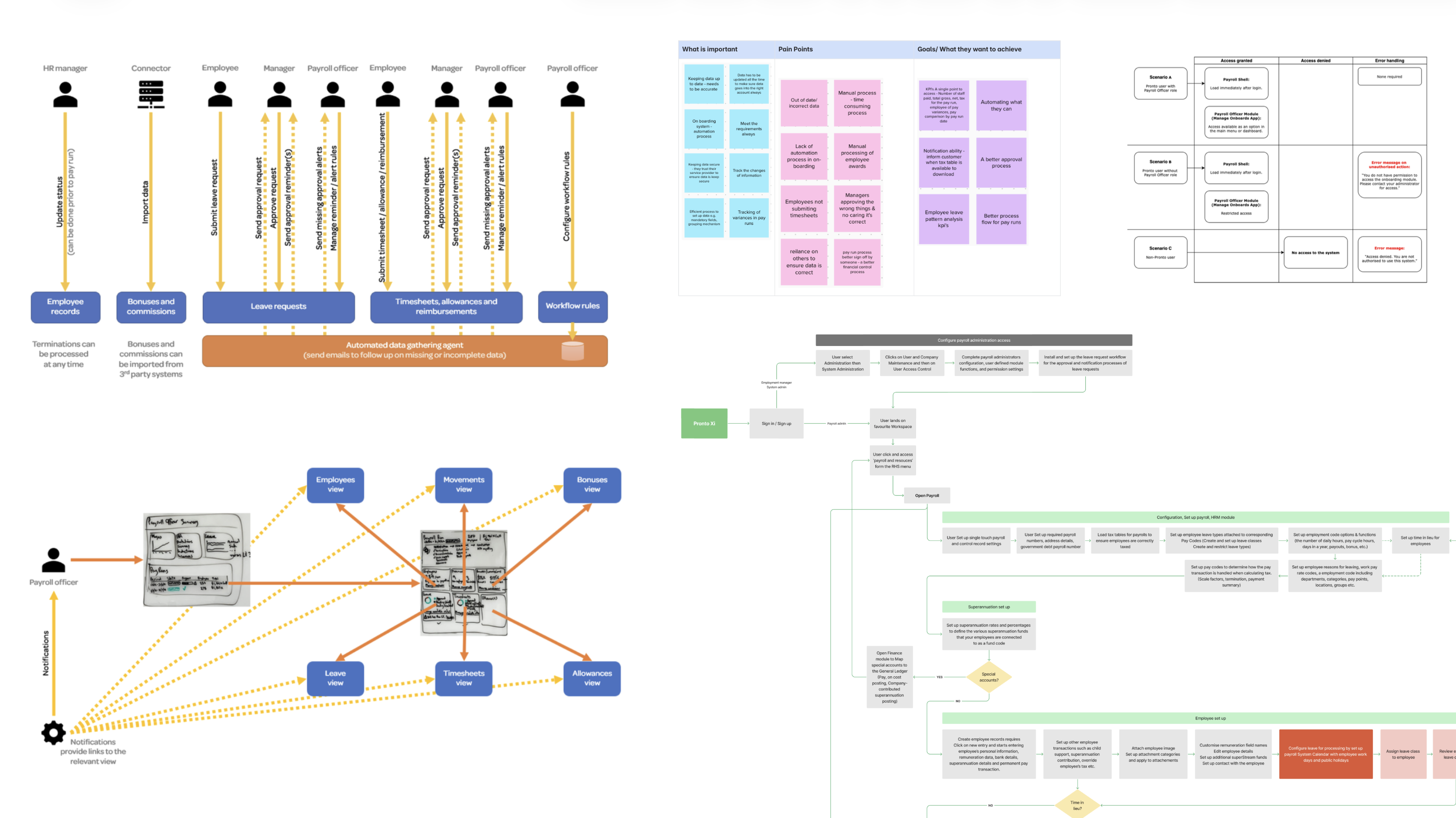
Structured research sessions with payroll officers and HR teams surfaced a consistent and specific set of problems. Payroll officers had no proactive notification when something was wrong — they discovered missing timesheets, unapproved leave, and incomplete employee records only when they were already blocking a pay run. The system relied on them to manually chase up other people for data it could have tracked and escalated automatically. Their goals were equally clear: a single dashboard showing wages, leave trends, pay run progress, and HR actions in one view; automated reminders that escalated through the management chain when not resolved; and a pay run interface built for passive monitoring rather than constant manual intervention.
These sessions also produced a Payroll Storyboard — a multi-role, swimlane-style scenario document mapping the full payroll run preparation cycle across HR managers, connectors, employees, line managers, and payroll officers. This wasn't a deliverable for engineering. It was a shared vision of how the system should behave: proactive, automated, and human-centred — the standard every subsequent design decision was measured against.
September 2022 discovery workshop
Service blueprint and user journey mapping
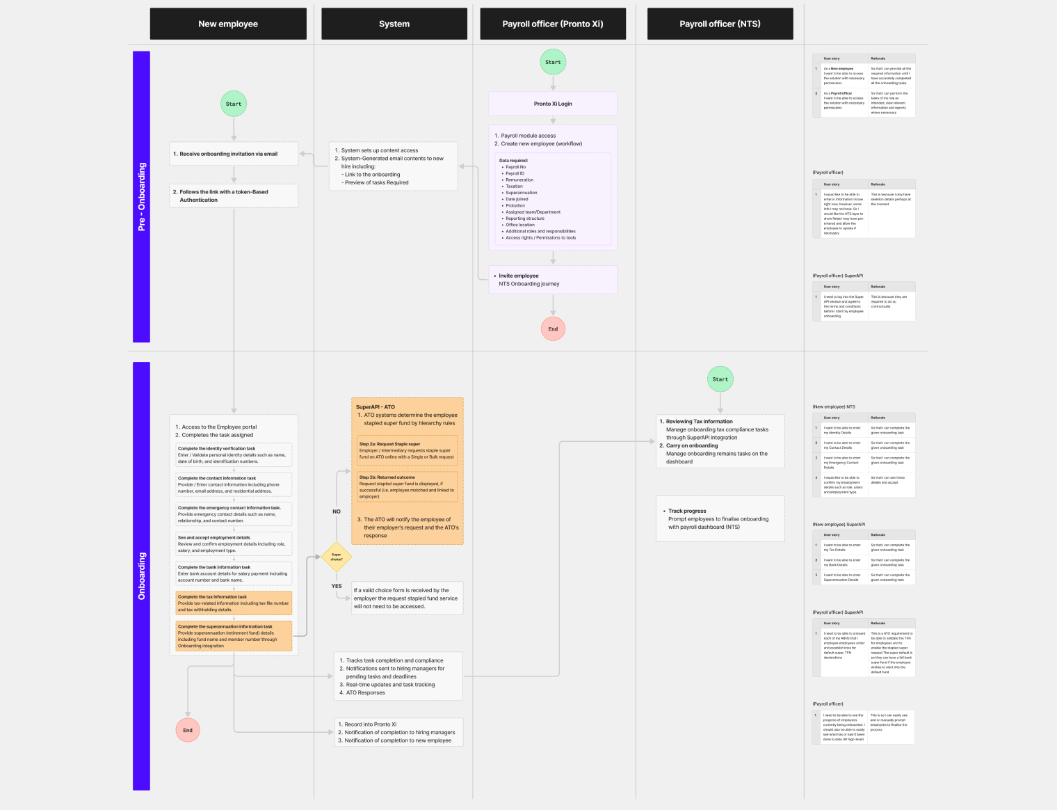
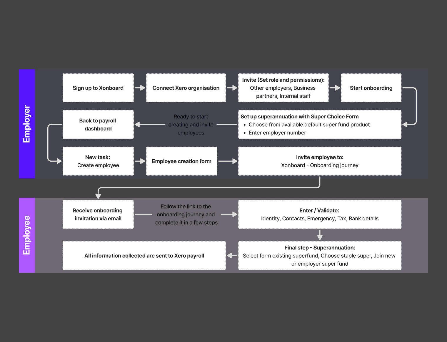
For employee onboarding, the research translated directly into a service blueprint mapping the full Pre-hiring → Day-one → Post-onboarding lifecycle across five dimensions: user actions, frontstage experience, backstage system processes, support processes, and compliance requirements. Alongside it, I produced a swimlane flowchart with four parallel lanes — New Employee, System, Payroll Officer (Pronto Xi), Payroll Officer (NTS) — showing exactly where responsibilities transferred between roles, where the system needed to act autonomously, and where human decisions were unavoidable.
These artefacts weren't documentation for its own sake. They were the tool I used to define UX requirements and business logic simultaneously — frontstage screen flows for employees (invitation email, registration, task completion, profile), and backstage flows for payroll officers (create employee, assign tasks, manage SuperAPI compliance, track progress). The swimlane made it impossible to design one without understanding the other.
User Journey
High-Level Swimlane Flowchart
Service Blueprint
Onboarding Viability Flow
Benchmarking the competition
A structured competitor analysis reviewed four platforms — Workday, SAP SuccessFactors, Oracle, and Odoo — assessing information architecture, UI clarity, and feature completeness across payroll, workforce management, and employee self-service. Workday emerged as the benchmark: modern, clean, with intelligent automation and a people-first experience. SAP and Odoo were rated "good" — content-rich but requiring effort to navigate. Oracle fell short on seamlessness.
The gaps identified in this analysis directly informed the design direction for Pronto Xi's navigation, launchpad, and onboarding flows. Notably, the benchmarking reinforced what users had already said: the leading platforms didn't make users go looking for problems — they surfaced them proactively.
Testing navigation models before committing to one
Navigation was one of the highest-stakes decisions in the entire engagement. Getting it wrong would affect every user, every day. Before proposing a direction, I first conducted a heuristic evaluation of the existing system against 16 established usability principles — covering consistency, efficiency, learnability, error prevention, accessibility, role-based access, and contextual help — to document exactly where the current architecture failed.
I then designed and tested five distinct navigation models, each representing a different structural approach. Model 0 was the current state: a vertical side-tree with collapsible rail. Models 1 through 4 introduced progressive variations — top-shell navigation with dropdown menus, custom business-specific menus, contextual subshell navigation, breadcrumb backtracking, and LHS rail with module dropdown combinations. Each was prototyped and tested with real users through structured sessions with specific task scenarios and a Microsoft Forms survey capturing both qualitative and quantitative data.
The testing revealed something important: users consistently valued a clean, well-categorised landing page and clear module identification, but were confused by any split navigation where the entry point and second-level navigation lived in different places. The home button wasn't identifiable in models that buried it. "Overview" as a label meant nothing without context. The winning model combined consolidated top navigation, strong breadcrumbs, and a contextual dropdown redesigning "Overview" as a gateway to dashboard, working board, and manager view.
These findings weren't just useful — they were decisive. The final navigation system was built directly from what users rejected and what they endorsed.
Design: from system to surface
Research gave us the foundation. Design was how we built on it — iteratively, in close collaboration with engineering, and always traceable back to a documented user need.
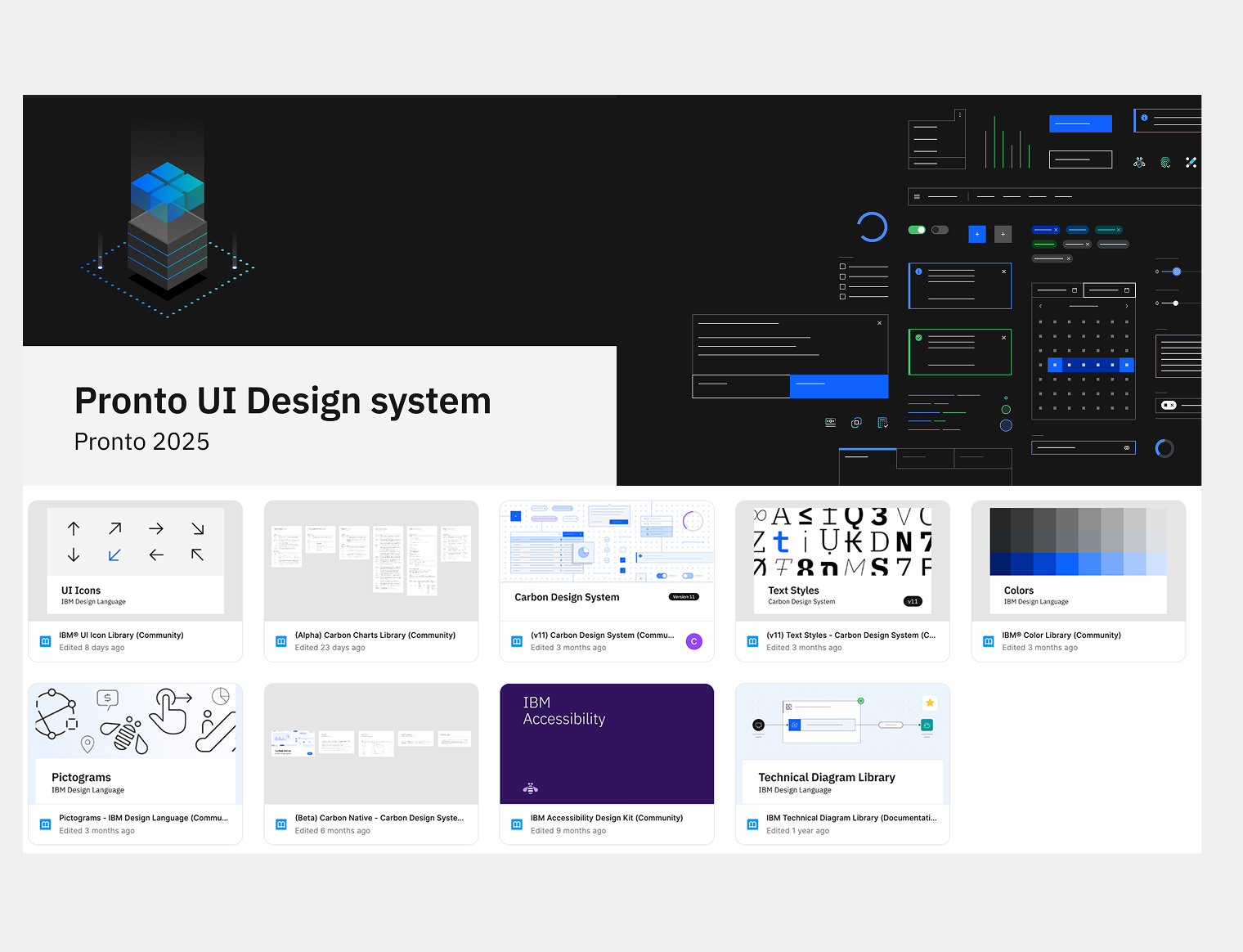
A design system built to last
The design system became the operating infrastructure for the entire product. Built on IBM Carbon v11 and extended with Pronto Xi-specific components, it covers 44 components across 56 documented pages — with a full token system for colour, spacing, and effects. Where Carbon had gaps for ERP needs, components were built from scratch. A clear lifecycle governed every component: Labs → Preview → Stable. Engineering always knew exactly what was ready to build.
Three AI-native components — AI label, AI layer, and AI explainability popover — were designed into the system before Pronto Pixi launched. When the product was ready for AI, the infrastructure already was. No retrofit, no catch-up sprint.
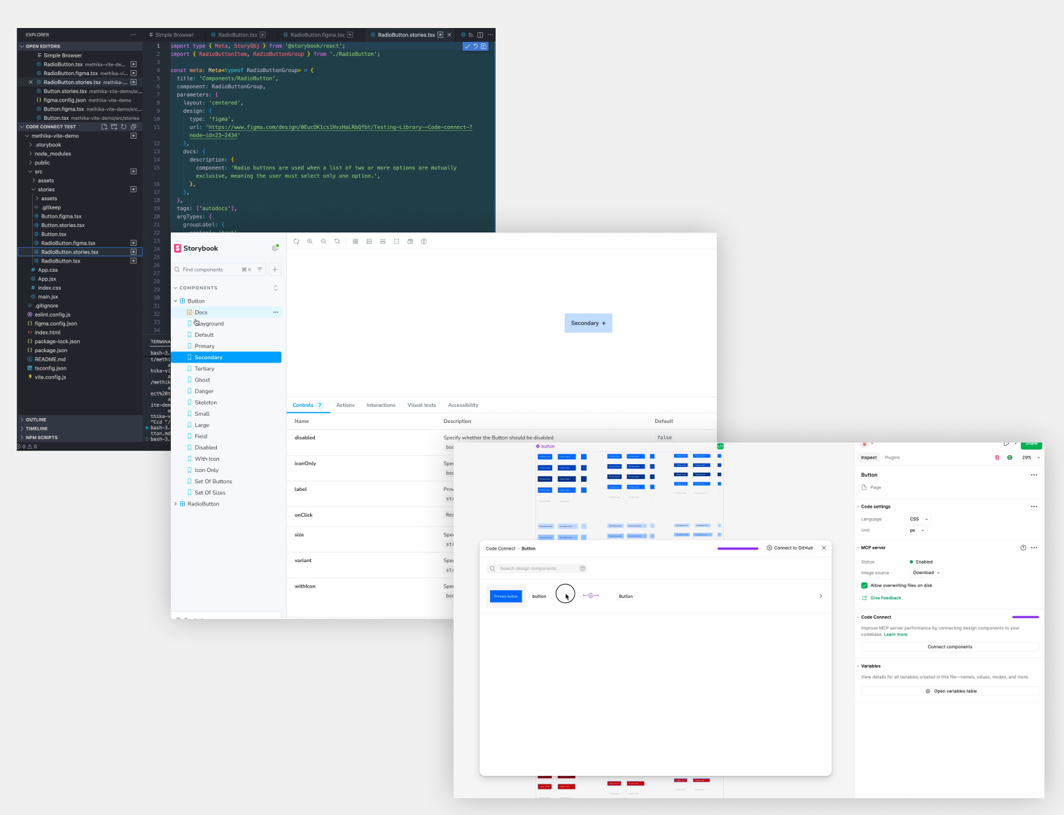
Design tokens and components were live-linked to the engineering codebase via Code Connect, making the design system the single source of truth for both teams and eliminating handoff friction entirely.
Pronto UI design
Component lifecycle and Code Connect
Navigation and information architecture
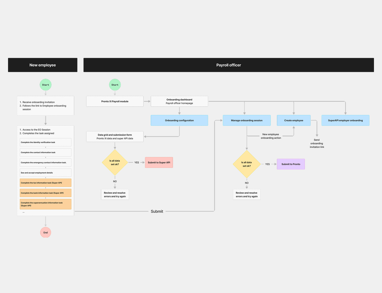
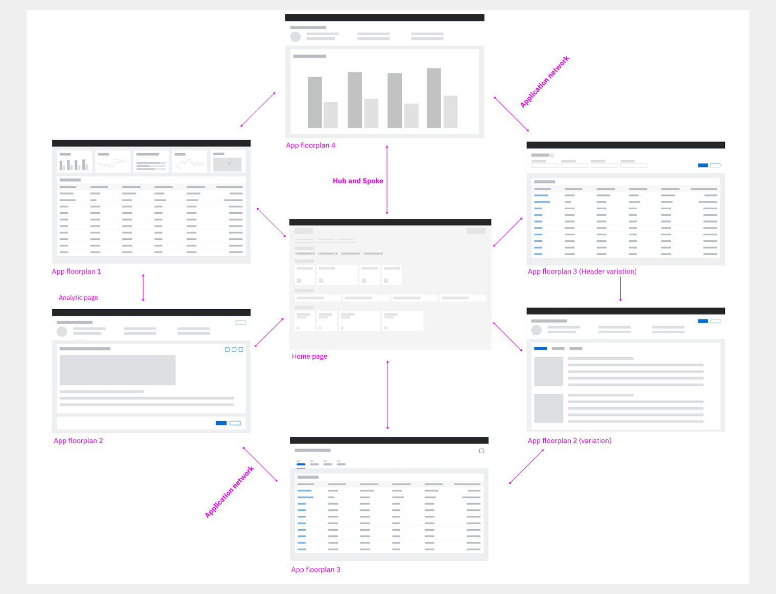
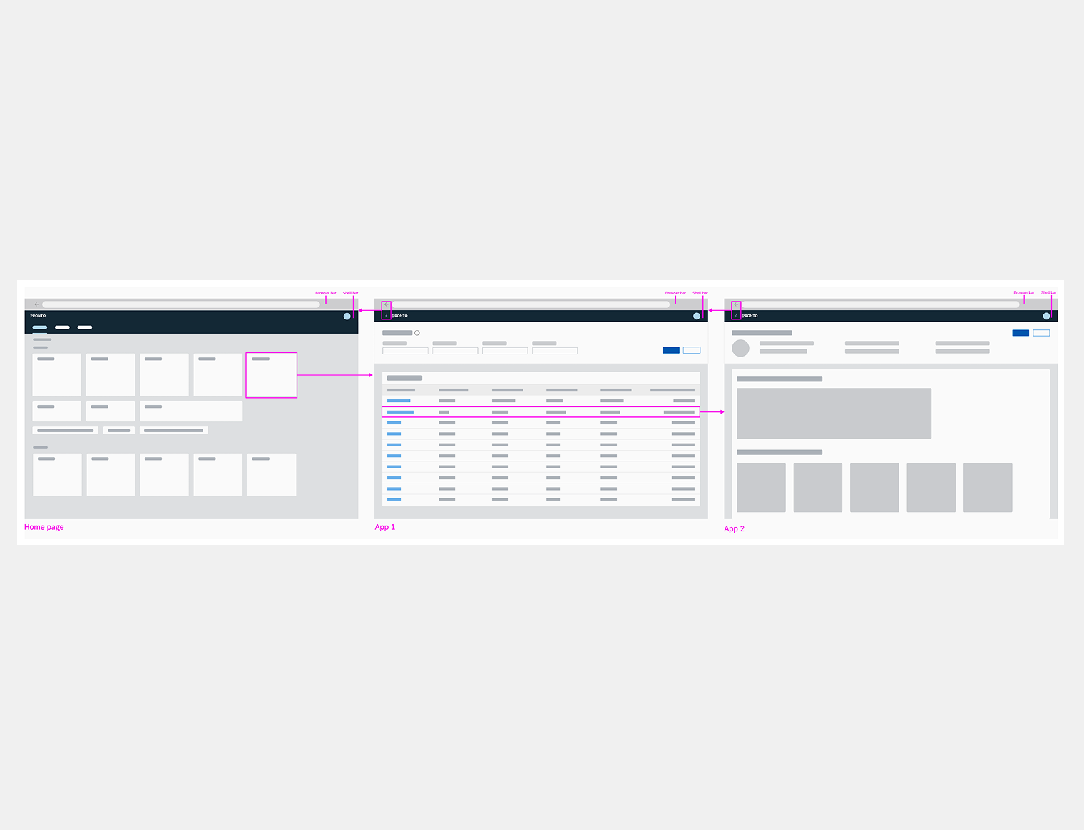
The research findings translated directly into a navigation architecture built on the HUB–SPOKE–OBJECT model: a central launchpad as the entry point, Spoke views for list-level interaction, and Object pages for detailed record flows. Users can navigate from the launchpad to any specific programme drilling just three levels down — no deep nesting, no lost context.
Five SPOKE template types — Object Page, Overview, Analytical, Fast Entry / Wizard, and List Report — give every screen a consistent structural home, so users always know where they are and how to get back. The result was a 40% improvement in task completion times, validated across multiple rounds of documented user testing.
Application network - Hub and Spoke model
Navigation example
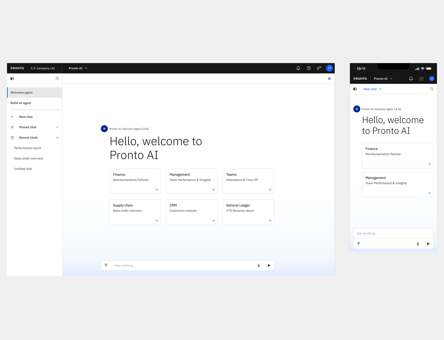
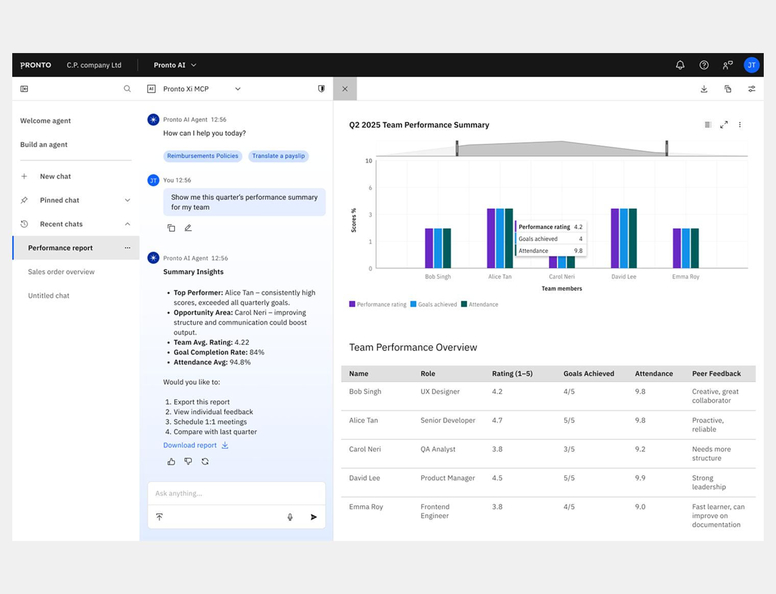
Pronto AI embedded in the product
Pronto AI is the conversational AI assistant for Pronto Xi, grounded in a research phase that applied an AI context model — mapping Human (Domain experts), Business (operational needs), Machine (ML capabilities), and World (external data and policy) — to define where AI could genuinely add value rather than create noise.
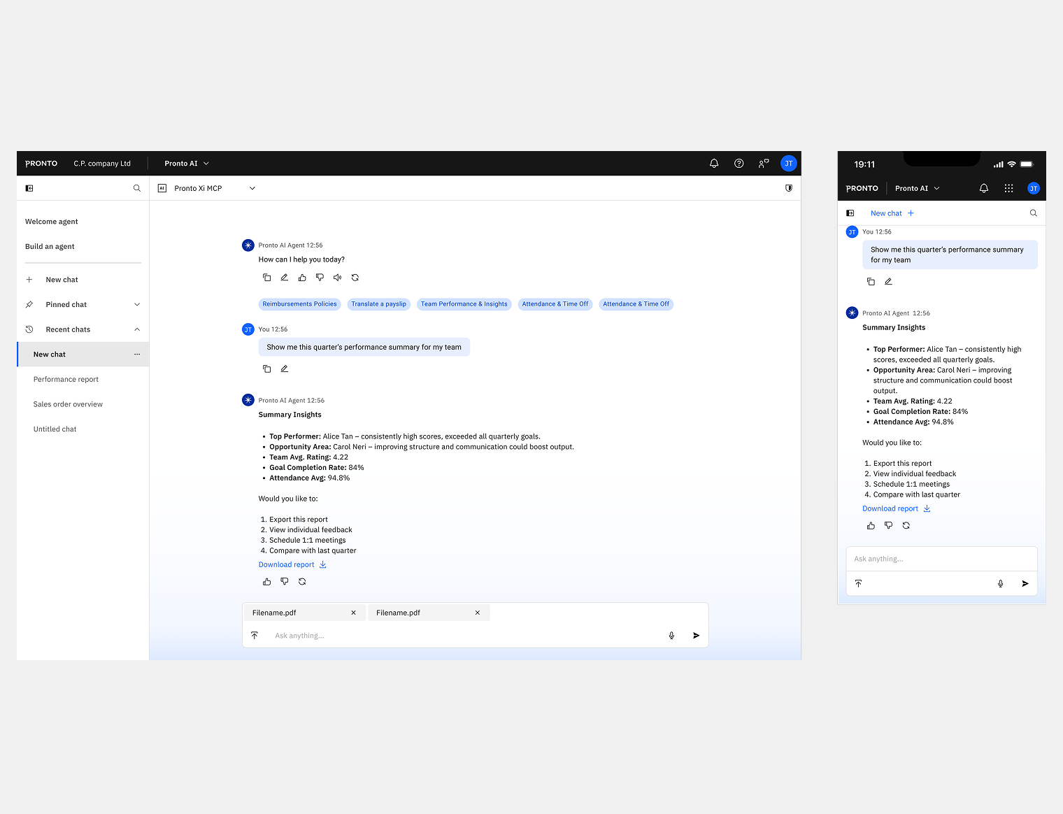
The assistant was designed in two modes. Assistive mode surfaces inline within the current workflow — answering queries without breaking the user's context. Immersive mode is a full-screen conversational interface with chat history, rename and archive functionality, and live voice input.
The POC was presented at Pronto's sales conference before moving to full production design. Because the AI components were already in the design system, shipping Pronto AI required no structural rework — just execution.
Pronto AI - Immersive initial chat
Immersive chat - Prompt and Output
Immersive chat - Report in sidepanel
Assistive chat overflowing
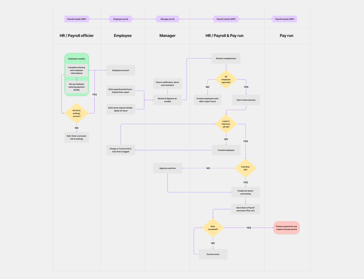
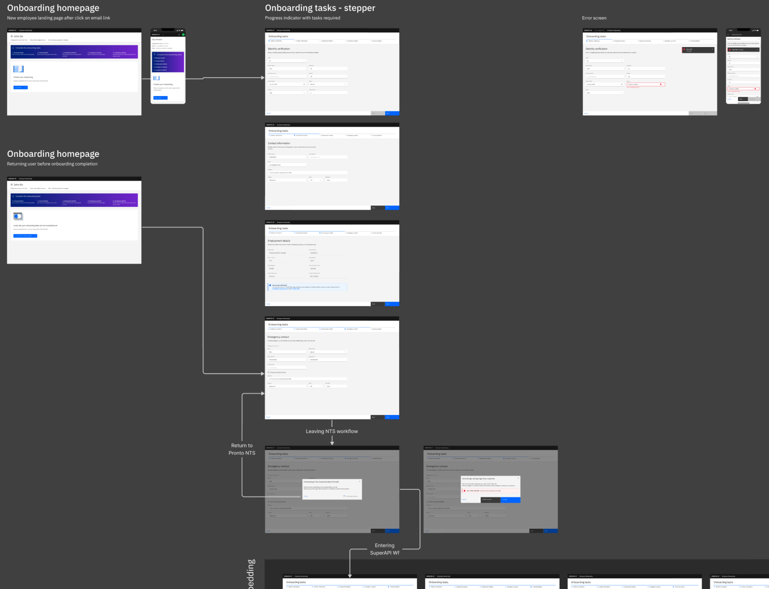
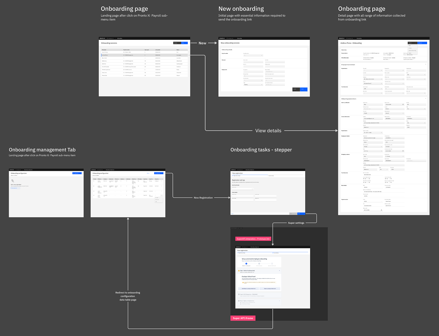
Employee onboarding — the launch vehicle
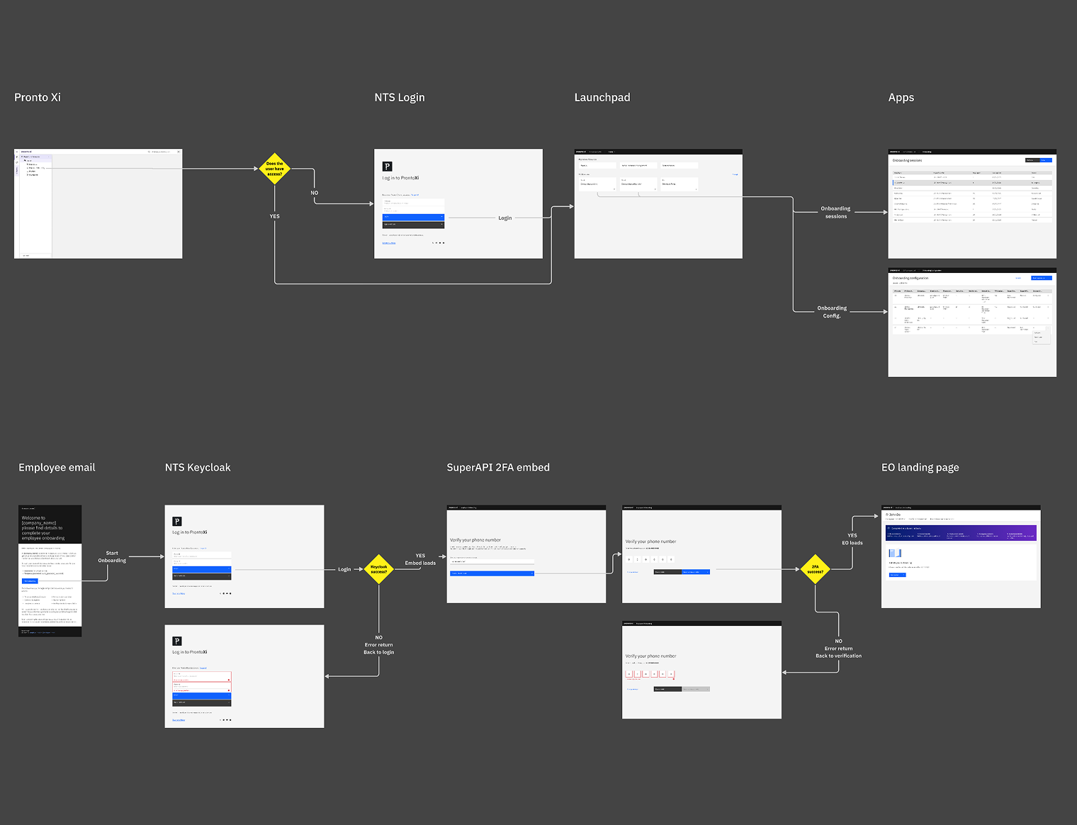
Employee onboarding was the first product area to ship on the new platform, and the research investment behind it was proportionate to its complexity. The swimlane flowchart, service blueprint, and XOnboard/SuperAPI process analysis all fed directly into the final design.
Four role-specific flows were designed — for the new employee, the payroll officer, the employer, and the payroll app launch — each reaching V1 Stable with independently versioned documentation. The employee flow covered invitation via token-based authentication, identity verification, personal and contact details, tax file number entry, bank account setup, superannuation selection via SuperAPI, and employer detail review. The payroll officer flow covered employee creation, onboarding session management, SuperAPI compliance tracking, task assignment, and progress monitoring from the NTS dashboard.
The design extended well beyond screens. Email touchpoints, 2FA authentication, a full service blueprint, and ATO compliance via SuperAPI were all part of the scope. This was a service design problem first, and a screen delivery exercise second.
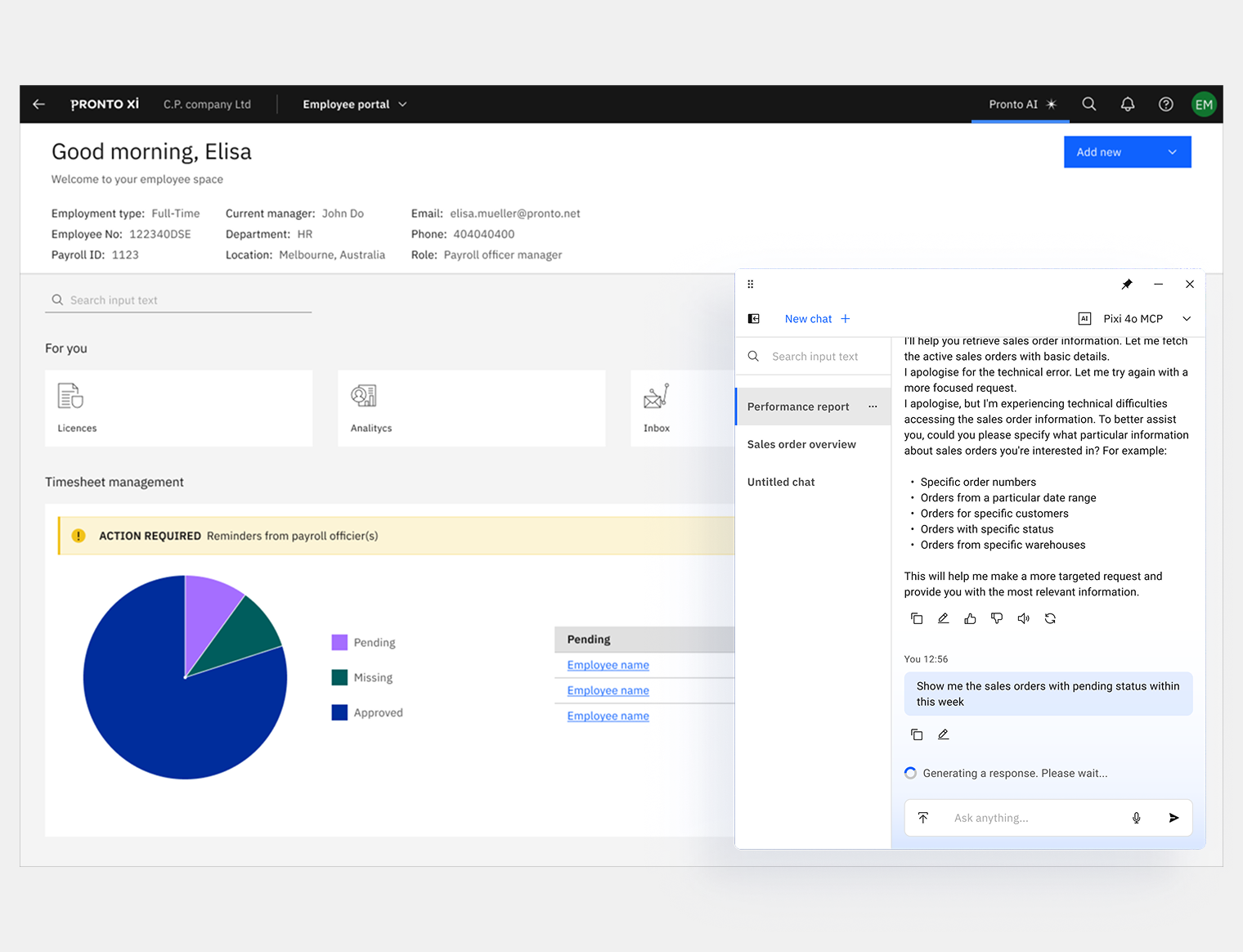
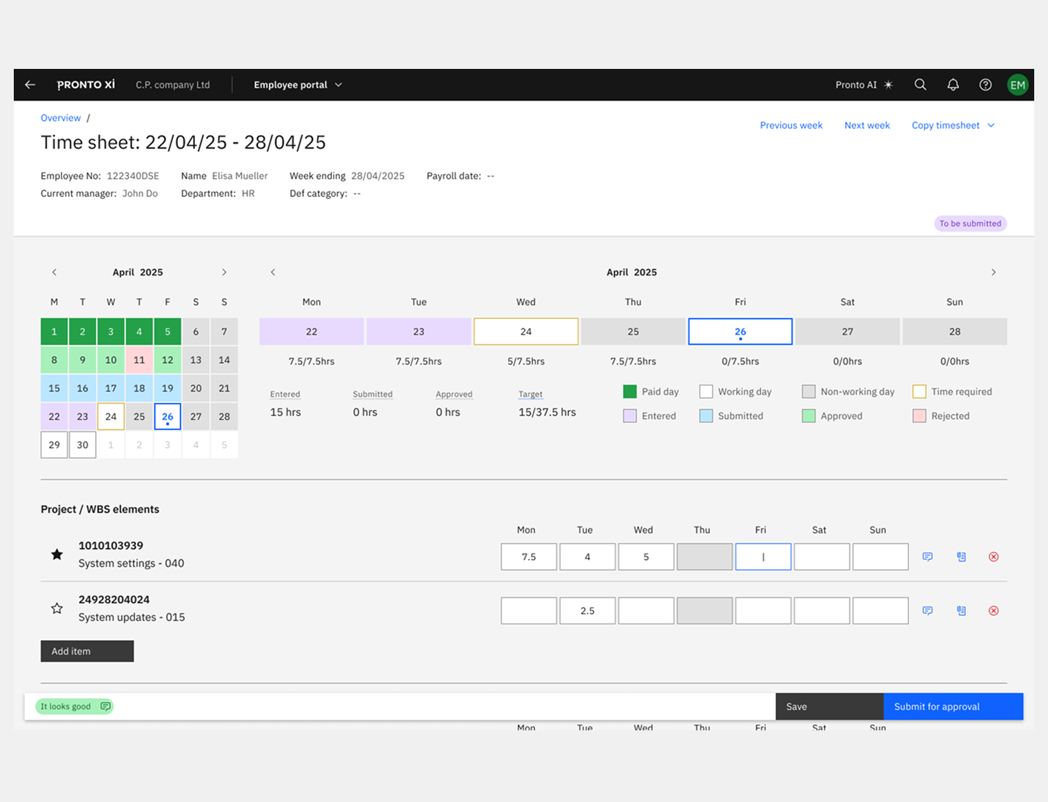
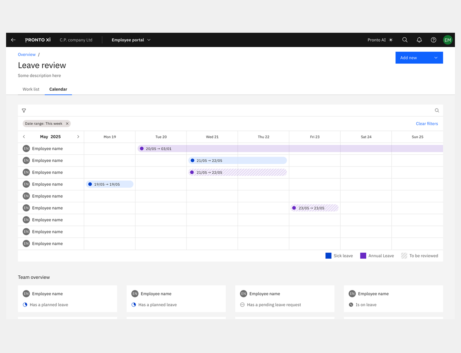
The Employee Portal covers personal details, employment records, leave, timesheets, manager views, company switching, and user settings — across both desktop and mobile. Employment details alone went through three formal evaluation rounds, each iterated against engineering feedback and user testing before reaching the current MVP. Manager views are designed as a distinct access layer — different responsibilities, same design language.
Employee Portal Empployee view
Employee Portal Manager view
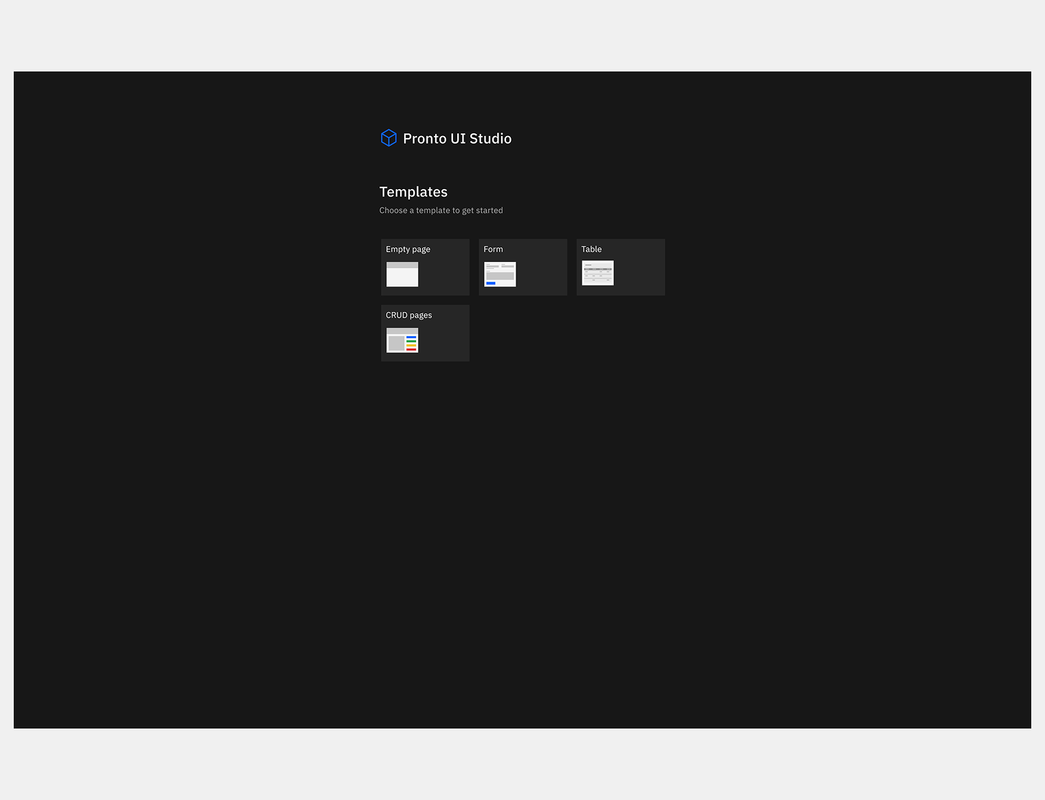
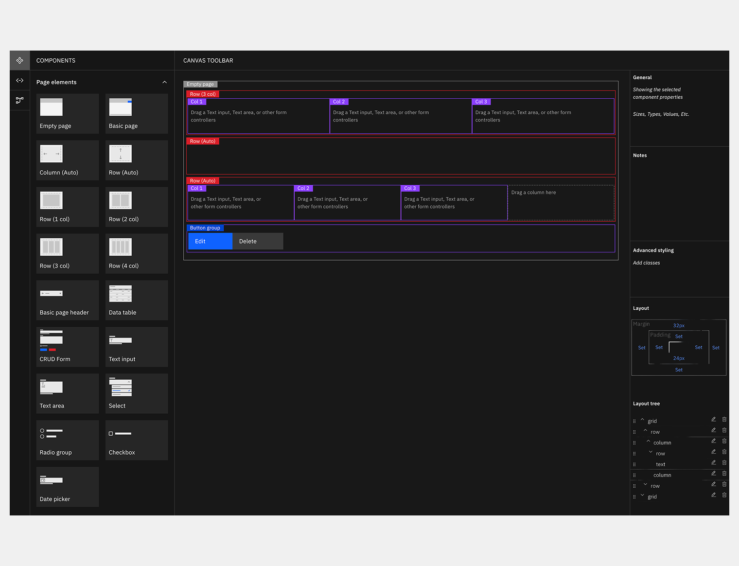
Pronto UI Studio — UX for the builder itself
The design system wasn't just for end users — it also had to work for the developers building on top of it. Pronto UI Studio is a no-code layout builder that lets developers compose screens by dragging components into responsive grids. But the original builder had a usability problem of its own: developers couldn't easily tell where to place components, how columns and rows related to each other, or which components were compatible with which zones.
I approached this the same way I'd approached every other surface — by understanding the user first. Developers needed clearer visual cues for compatible drop zones, colour-coded differentiation between layout areas, real-time feedback when a component was dropped somewhere incompatible, and helper text that reduced guesswork without requiring documentation. Benchmarking against IBM Carbon UI Builder, SAP Business Technology Platform, and Bubble.io identified the patterns that worked best at this scale. The solution added a categorised component panel on the left, clear labels and colour-coding on the canvas, and an advanced properties panel on the right — turning an opaque tool into something developers could use with confidence.
UI Builder - Initial page
UI Builder in action
Product requirements and service design
UX drove product definition throughout. I authored full requirements across seven feature areas with user stories, sprint estimates, and release mapping — all documented in Confluence and used as the operating reference for engineering, product, and stakeholders. The work didn't stop at Figma. It shaped the backlog and gave the team a shared language for making decisions together.
Challenges
Earning design credibility
In an engineering-led organisation that had shipped for decades without a designer, authority had to be earned sprint by sprint — by contributing to architecture decisions, not just delivering screens.
Designing while the architecture moved
Transitioning from a monolith to microservices meant requirements often had to be defined before the infrastructure that would serve them existed. The ConOps and swimlane artefacts were the tools that kept design and engineering aligned under that uncertainty.
Compliance as a design constraint
Superannuation validation, BSB verification, GDPR and CCPA — every flow had to be legally and architecturally sound before it could be visually resolved. Regulatory requirements shaped interaction decisions throughout.
Designing for AI before AI was ready
Embedding AI components into the system from the start required conviction about where the product was heading. That conviction paid off — no rework when Pronto AI launched.
Scale and coherence across five roles and six surfaces
The design system was the answer, but only because it was built as infrastructure, not decoration.
Impact
90% of MVP use cases passed user testing. Navigation efficiency improved by 40%. Competitive UX positioning improved by 30% against Workday, SAP, Oracle, and Odoo benchmarks. Three years into the engagement, the work continues — because embedding UX as a strategic discipline inside a product organisation doesn't end at delivery.
90%
MVP use cases passed user testing
40%
Improvement in navigation efficiency
30%
Improvement in competitive UX positioning
Competitive UX edge
30% improvement in competitive UX positioning — benchmarked against Workday, SAP SuccessFactors, Oracle, and Odoo via a structured competitor analysis.
Navigation efficiency
40% improvement in task completion times — validated across 88 navigation test frames and iterated through multiple documented user feedback sessions.
MVP success rate
90% of use cases validated in user testing — across 576 production-ready frames in the MVP stream, spanning all five user roles, six product surfaces, and 22+ months of active engagement.
Similar challenge?
If you're scaling UX across multiple products, embedding design practice in an engineering-led organisation, or building design systems as operating infrastructure — this engagement model (ongoing, embedded UX leadership) is how I work best.
Pronto Software needed more than screens. They needed a design practice, a system to build on, and a designer who could speak both languages — business and engineering — and hold them together. That's what this engagement delivered, and continues to deliver.
Want to know more?
Request the full business case study or working files to explore how I
deliver exceptional value. Discover the impact firsthand!
👋 Hi! I'm Carmelo's AI assistant. I'm trained on his portfolio, case studies, and expertise in design and digital transformation. Ask me anything about his work, design process, or career!
This AI model is in beta and may not always be accurate.