
Update cookies preferences

Ask to Carmelo’s AI

👋 Hi! I'm Carmelo's AI assistant. I'm trained on his portfolio, case studies, and expertise in design and digital transformation. Ask me anything about his work, design process, or career!

This AI model is in beta and may not always be accurate.

Project information

Tools

Figma

Ticketmaster Italia sells tickets. The harder part is the path before that: finding the right event in a crowded page, trusting a list where fees only appear at the end, and landing on an event page where the seat, the price and the order live in separate columns. This concept redraws that path — homepage, category and event detail — across desktop, tablet and mobile.

Challenges and Opportunities

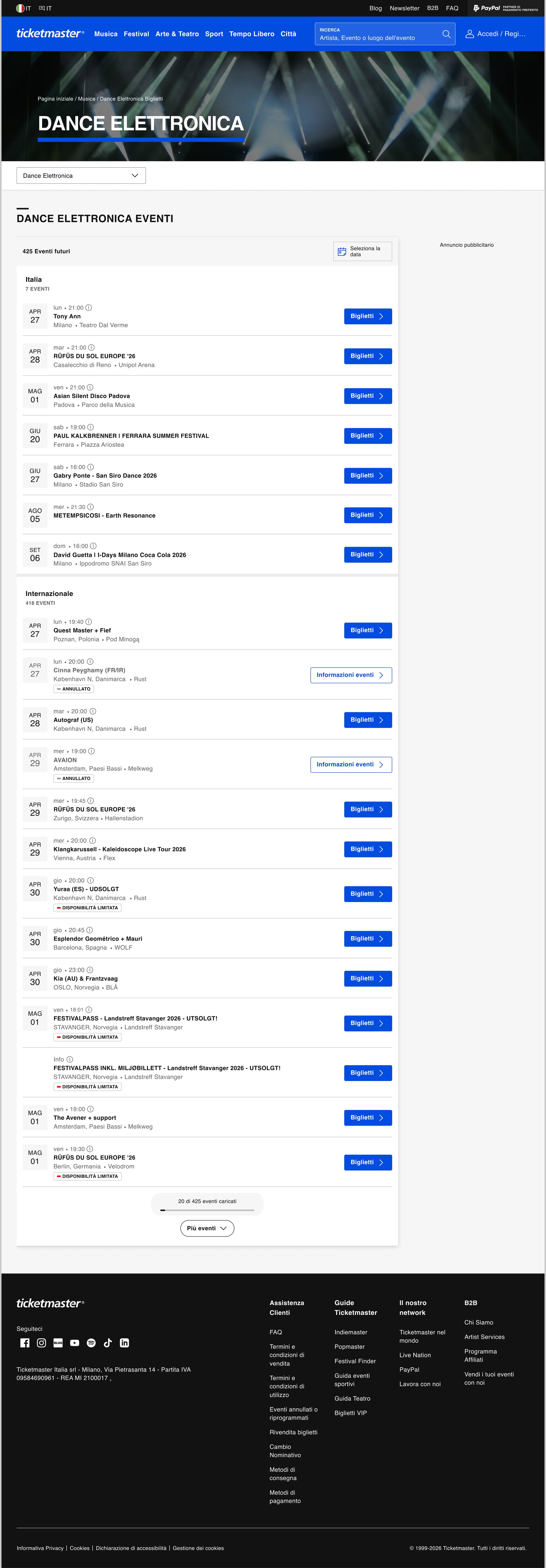
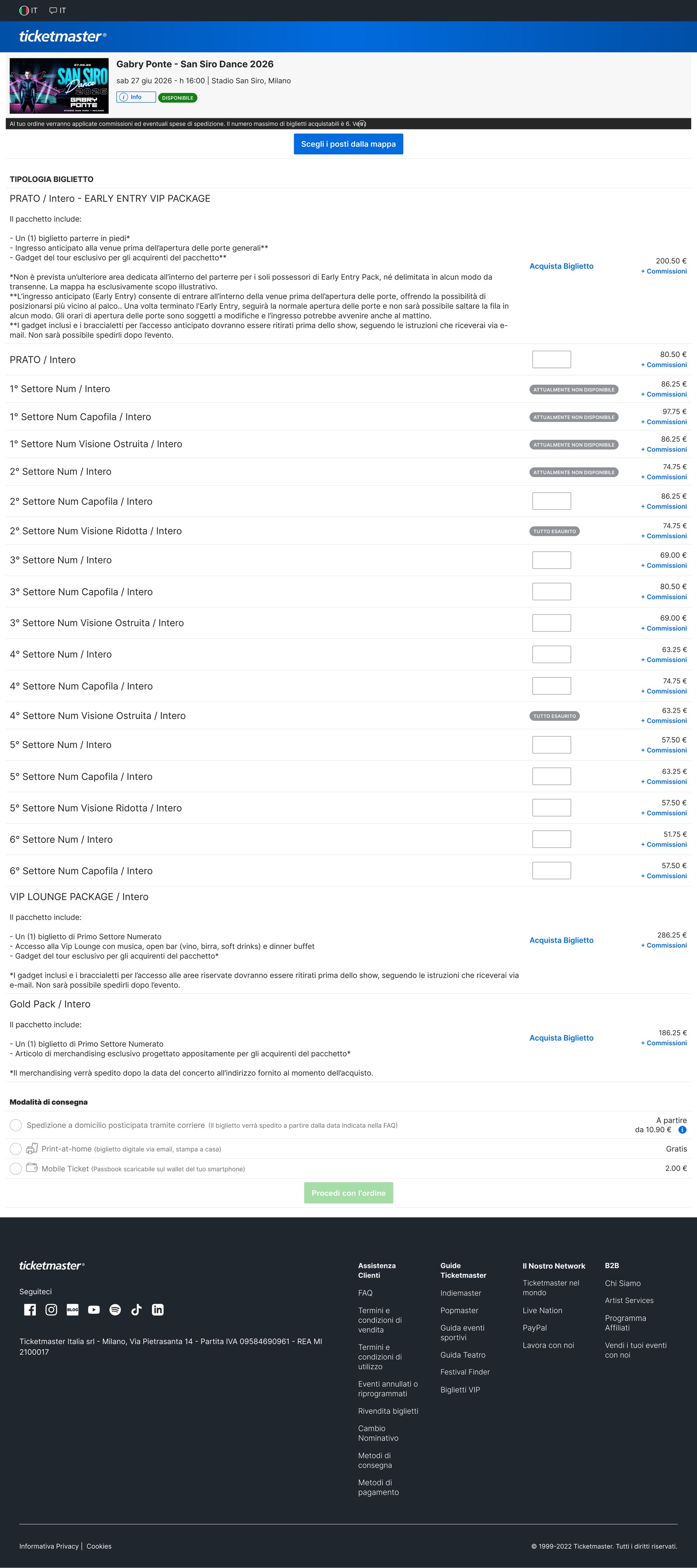
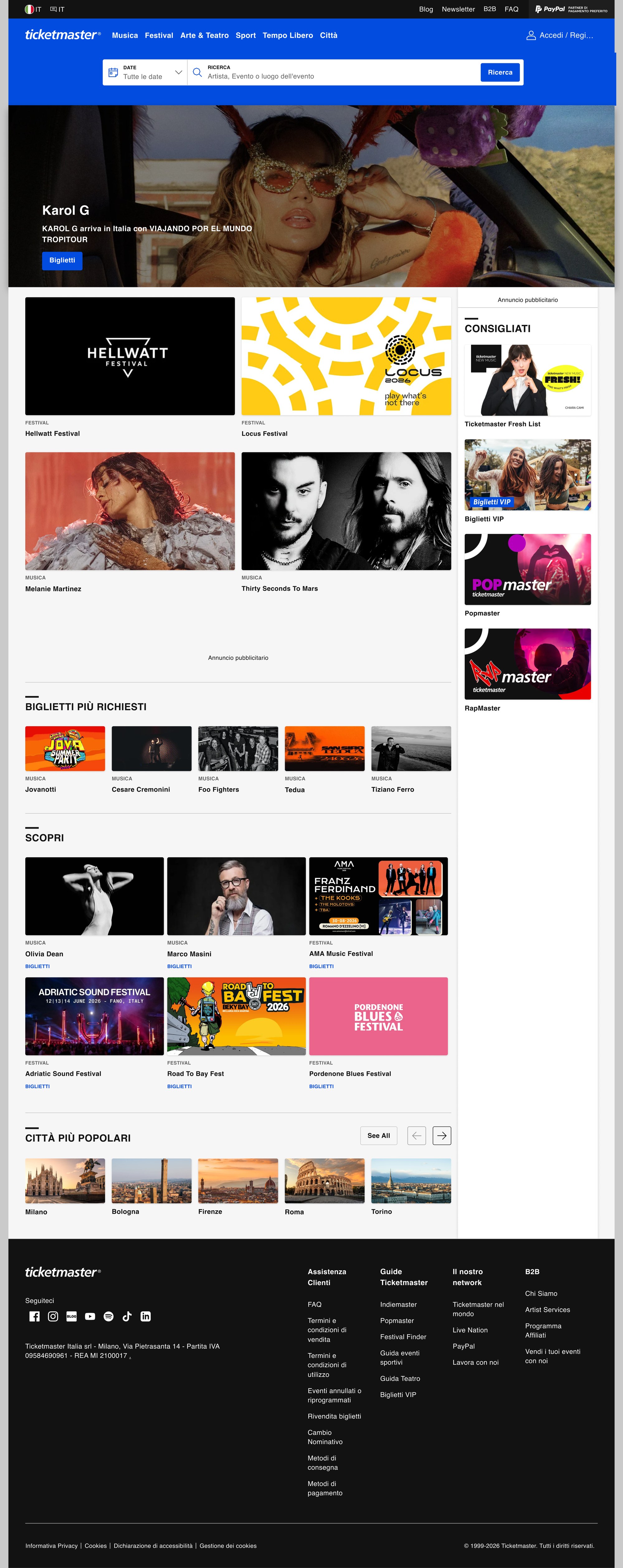
The homepage stacks search, hero, editorial content and ad placements in a single view with no guided path to purchase. Events compete with banner ads; merchandising relies on placeholder imagery. In the category, filters cover little more than date — no sub-genre, no geographic grouping. A list of hundreds of events needs a city, a date and a status readable in one pass. On the event page, ticket types, seat map, fees and order summary split into separate areas. On mobile, these become a sequence of disconnected decisions. The fee total only appears at checkout — sometimes 30–50% above the listed price.

The opportunity is hierarchy and transparency. The brand stays. The concept works within the existing design system, extending it with local components where needed. Every page gets a defined cognitive path: a clear entry point, a structured flow, and a purchase panel where the seat and the final fee are always visible together.
Methods

As-is audit

I analysed the live site page by page — usability, visual hierarchy, accessibility, navigation and interaction patterns. The audit made the structural problems explicit before any redesign work began.

Concept — Feel the Moment

Choosing an event is the start of an experience. The concept direction centres on three pillars: Respect (work within the design system), Clarity (one cognitive path per page), Context (geo-relevance and fee transparency throughout).

Homepage and category

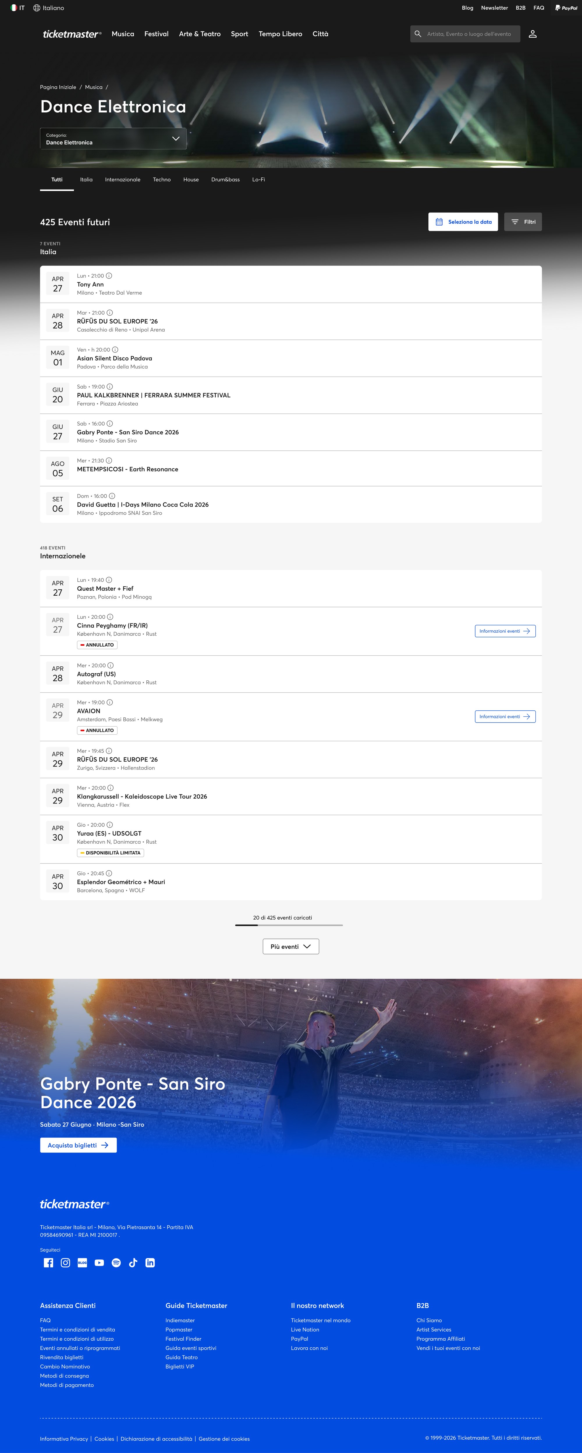
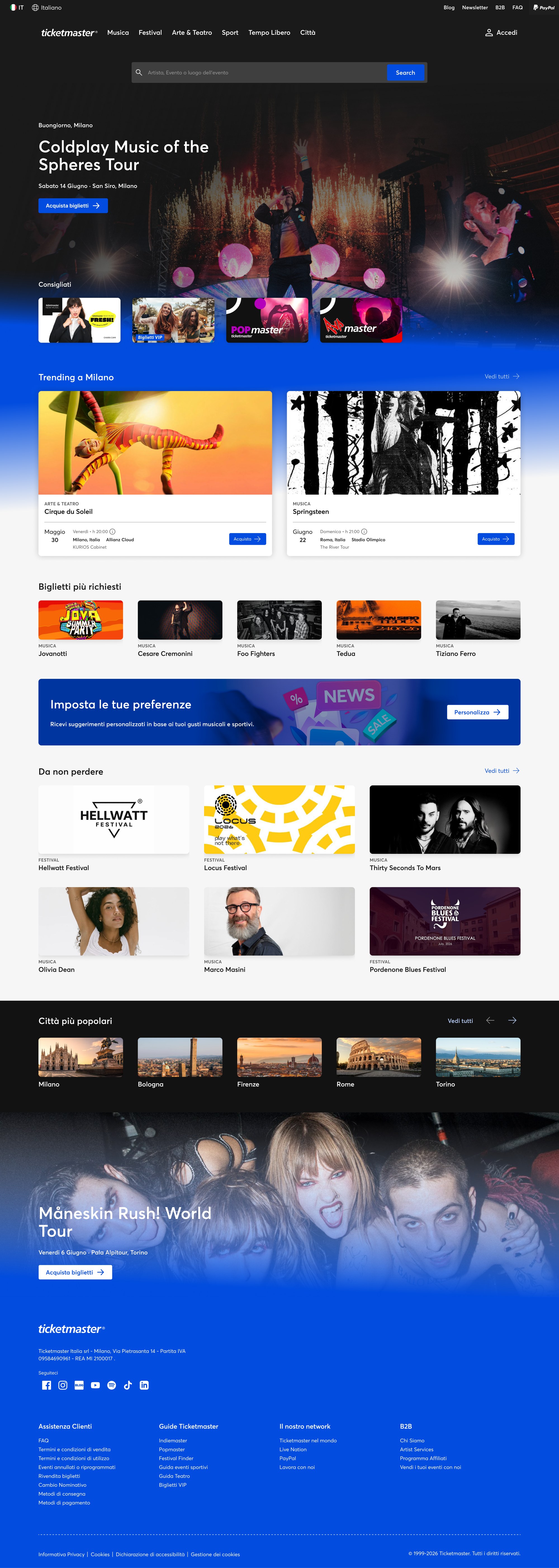
Homepage: geo greeting, featured event, clear hierarchy, no competing ads. Category: filters for place and sub-genre alongside date, an event counter, and a row format where city, date and sale status are readable at a glance.

Event detail and responsive

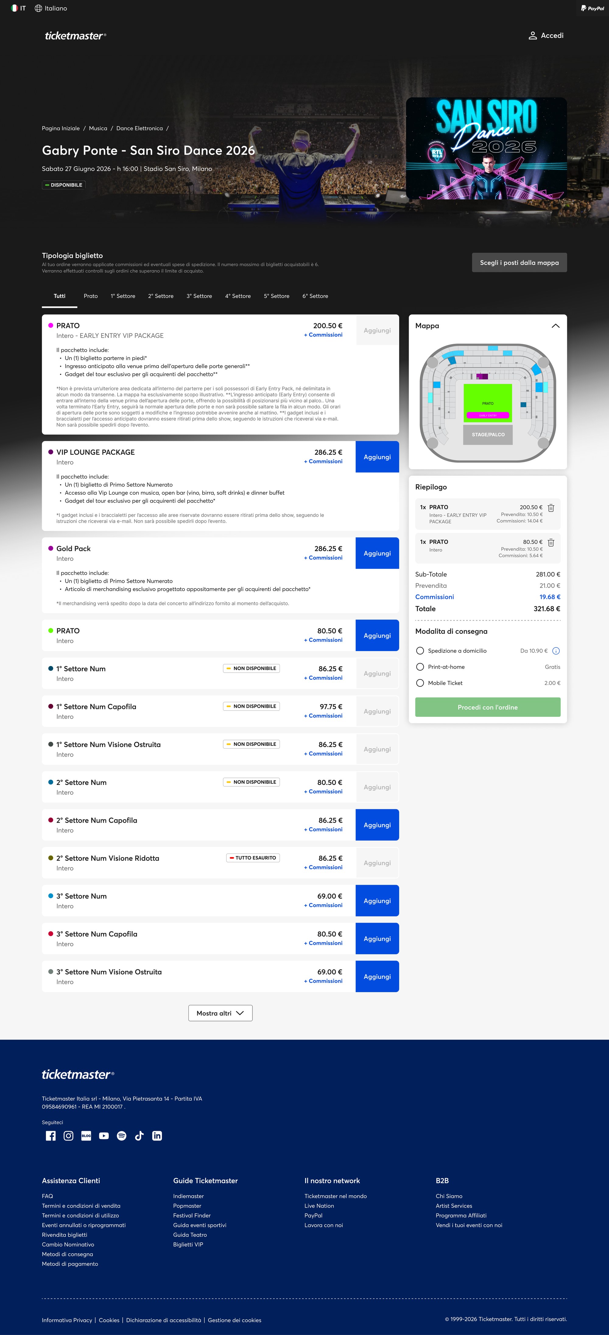
Ticket types, seat map, fees and cart summary share one panel. The fee breakdown is visible before checkout. Full responsive coverage: desktop 1512px, tablet 834px, mobile 390px — on mobile, seat selection from the map leads the flow.

Outcome

The concept maps a single cognitive path from discovery to purchase.

  • Homepage: geo greeting, featured event, and a direct route to buy — ads removed from the primary viewing area.
  • Category: filters for place and sub-genre alongside date; an event counter; every row shows city, date and sale status at a glance.
  • Event detail: ticket types, seat map and fees share the same panel; the final price — including booking fees — is visible before checkout.
  • Personalisation: a preference prompt and a Recommended section adapt the homepage to the user's location and purchase history.
  • Responsive: three independent layouts — desktop 1512px, tablet 834px, mobile 390px — with seat selection from the map leading on mobile.

This is a concept for Ticketmaster Italia. It is not a released product.

Homepage before
Homepage — before
Homepage after
Homepage — after
Category before
Category — before
Category after
Category — after
Event detail before
Event detail — before
Event detail after
Event detail — after
Phone before
Phone — before
Phone after
Phone — after

Want to know more?

Request the full business case study or working files to explore how I deliver exceptional value. Discover the impact firsthand!

Other case studies

Ticketmaster concept
TICKETMASTER

A concept for finding the show and choosing the seat

pronto-nts
PRONTO NTS

Building UX from the ground up inside Australia's leading ERP platform

mint
MINT

Automated Ad-Ops with MINT - An integrated design approach

generali
GENERALI

Build In-House design excellence through Scalable, Cost-effective solutions

Show More
mint
MINT

Automated Ad-Ops with MINT - An integrated design approach

generali
GENERALI

Build In-House design excellence through Scalable, Cost-effective solutions

pronto
PRONTO

Driving scalable and balanced innovation by transforming Pronto Xi

banco
BANCO BPPM

Applied framework for YouBusiness Web plug-in design to foster user satisfaction

accenture
ACCENTURE

Enhancing interaction design management

intesa
INTESA SAN PAOLO

New credit granting experience for InBiz

job-card
PEDDERS

Re-thinking Electronic Job Card experience

lorraine
LORRAINE LEA

Bespoke E-business solution B2C and B2B website, CRM and sales portal

pronto-suite
PRONTO SUITE

Transforming Pronto’s app suite

hmi-manufacturing
HMI FOR MANUFACTURING

User-centered design for industrial HMI systems

polestar-hmi
POLESTAR HMI

A confident, human interface led by UX

Ask to Carmelo’s AI

👋 Hi! I'm Carmelo's AI assistant. I'm trained on his portfolio, case studies, and expertise in design and digital transformation. Ask me anything about his work, design process, or career!

This AI model is in beta and may not always be accurate.